Tuesday, September 26, 2017

Hannah Rosales Reviews Marina Abramovic


Marina Abramovic was born in Belgrade, Yugoslavia in 1946. She predominantly uses the body in her performance art. She has thoroughly explored the body mentally and physically. In this particular work, Abramovic eats an onion while looking up at the sky complaining about her life. This onion is a whole onion with the skin on. She complains about her everyday life, ranging from herself criticizing her body, to falling in love with the wrong man, to waiting at airports, train stations, etc.

My first thought is, what does the onion represent? And why a whole onion with the skin on? My speculation is that she chose an onion because onions produce tears in many people. She is most likely trying to convey her emotions through eating this onion. Thinking about how bad her life is makes her emotional. In many of the stills from the video, she looks like she is in agony. She could be trying to convey the idea that even though the things she is complaining about seem small, they heavily affect her. Many people undermine the things she’s complaining about so she might be trying to convey that she really struggles with these things. It would have had a different meaning if she’d used a different food such as a tomato. She possibly also chose an onion not only because they produce tears in people, but also because of the skin. Onions have layers, so metaphorically, she is revealing the layers of her day to day life. And that could be painful because being vulnerable is not always easy, even if what you’re revealing may be on “the surface.” In the two images she depicts two different emotions. In the image at the top, she looks as if she is in agony. However, in the image at the bottom, anger looks to be the emotion displayed here.


Saturday, September 23, 2017

Anna Brown reviews Mária Švarbová

Maria Svarbova was born in 1988 and currently resides in Slovakia. Inspiration for her fresh, dream-like scenes comes from her interest in Socialist era architecture and public spaces. Svarbova often captures simple, routine behaviors, but she does so with a cool sense of detachment and elegance that demands a response. Her aloof characters embody a sense of mystery, isolation and the human experience. This highly decorated contemporary photographer’s work has secured myriad publications worldwide including features in Vogue, Forbes, and The Guardian.

Of her In the Swimming Pool series Svarbova says, "People fascinate meSpace has no meaning without humans. The same also goes the other way around. Humans have no meaning without spaceThe main focus of my series was to harmonize the humans and space." The series, which began in 2014 is currently still being developed. Despite the retro feel of the images, they also evoke a futuristic quality that feels sterile and almost alien. Each person exists expressionless within the frame, but at the same time activates the space in a way that offers life to an otherwise lifeless, cold place. I was particularly drawn to Svarbova’s work because of my preexisting interest in other Soviet-influenced artists such as Ilya Kabakov, but this series spoke to me through its color palette and the minimal yet poignant moments she is able to capture.


Tuesday, September 5, 2017

Burk Frey reviews Tacita Dean

Tacita Dean, born 1965 in England, is known for her affiliation as a YBA (Young British Artist) and for her richly metaphorical film and photo work. Despite being a YBA, her work is dissimilar to the more renowned artists in that group, namely Damien Hurst.

I was particularly caught by her documentation of the performance work Craneway Event (2010) as it relates to this class. The piece itself is a nearly 2-hour long 16 millimeter film set in a San Francisco industrial building. It is a collaboration of sorts with master choreographer Merce Cunningham, who also appears as one of the subjects.


Dean herself believes she's "really never been able to do a single image. I’ve always worked in sequential images, everything always had a narrative." The viewer gets the sense that this sequential narrative space is indeed the one in which Dean is most comfortable. However, while the documentation stills from Craneway Event do fare better as a set, her success with it has at least partially hinged on the ability of each image to stand alone. Perhaps this is true for the majority of her work (see Kodak [2006] for another example).

A significant element of Craneway Event is the play of light streaming through the large windows, partially silhouetting the subjects and creating a pleasing inverted symmetry. Dean: "I always choose situations where the light is very important. The light is always a character. Craneway Event [is] so much about the light, in fact, the light is on equal footing with the dancers."


The documentation of Craneway Event makes for good imagery by itself, but also for a compelling life portrait of a man and his work. Through the choreography, the setting, and the hand of the artist, we sense both Cunningham's history and the Craneway building's history.

REB reviews Las Hermanas Iglesias

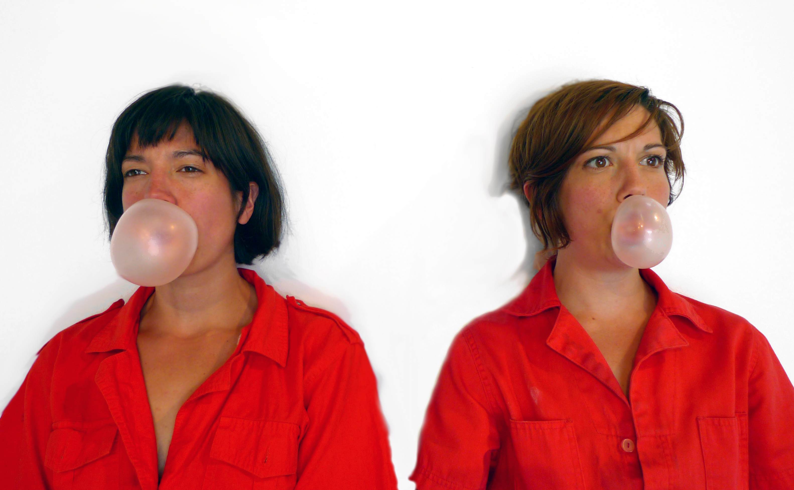
Lisa and Janelle Iglesias crated "Sibling Rivalry Series" which are a mixture of performance and stages photos. These two sisters went to different high schools, colleges and MFA programs but even though they were apart their interest in art grew gradually at the same time yet individually. Their collaborations started when they were in grad school and they would send drawings and ideas to each other by mail, they got to know each others practices more intimately and once grad school was over, they moved back to New York to start calibrating.  Their video "Cherry Contest" show Lisa and Janelle sitting at a table facing the camera with matching red jumpsuits. Then they start to shove cherries into their mouths in competition to see who can eat the cherries faster. Then they would try to blow the biggest bubblegum and measure precisely how far the bubble gum is away from their body. These sisters perform competitions with each other which are humorous but the performances, sculptures,video and photographs have a serious culture undertones.


Saturday, September 2, 2017

BELINDA FUENTES REVIEWS JULIE DE WAROQUIER


         Julie de Waroquier’s Inhabit is the exploration of homes and how they influence us. More specifically she describes the idea of her work as such, “We live between walls, but they inhabit us back; they contribute to building our identity. Moving indeed unsettles a whole way of life.” Initially the series appears as a list of aesthetics and it mostly is. Yet there are a few images in this series that are more successful conceptually. At the forefront is the use of lines from the light, floors, furniture and the cutting of the image into a triangle. Varied are the lines from diagonal to curvilinear. Most of the series includes deep shadows that cut of the information of the environment. The commercial clean look is a result of the triangular shaped images on top of white rectangular and square shapes. Additionally, the triangle shape that cuts up the images creates a rigidness to each of them. Color wise the palette is mostly blue and white but there are a few images that are warmer. One group of images that are more successful dynamically, are the ones with the body parts extending past the triangle. The couple if images that are more successful conceptually are the ones with her body contracting in some way right along the edges of the triangle because it lends to the idea of the home as a being and containing power over its inhabitants. This idea can also be extended to the fact that her face is subdued or hidden in every image.


BELINDA FUENTES REVIEWS ALAIN LABOIL


-->
            French photographer Alain Laboil’s series Reflexions Autour du Basin translates to Reflections Around The Pond. The images are just that, reflections in a pond that were stumbled upon when his children were around it. The soft reflections of the sky allow for the audience to transport to a world that somewhat appears as ours but is not. In his scenes he stages his children in various scenarios that are dreamlike. The family uses objects found around their pond and home such as sticks and brush to create these stories. There are even some photos with only constructed pieces and no figures, for example, the image with an insect holding a key. Images such as the one including an apple and one of his children holding a bow and arrow made out of sticks and another with one of his children on a ladder reaching for a soccer ball are more dynamic in that the physical objects on the surface of the water create dimension on an otherwise flatter image. Additionally, the water ripples from the physical objects create a sense of movement. In turn the movement of the water creates an interesting texture to the image. Secondly, the water distorts and elongates various body parts of the figures, adding to the fantasy, which are seen in the images with a boy with long fingers and another with a long torso. Alaina’s images naturally contain a blue, yellow and green color palette from staging outside. Overall the series is playful and childlike.