Friday, November 30, 2012

Chad Davis Reviews Alastair Magnaldo

    Often times when people are presented with something artistic it is related to issues, negative social commentaries, upsetting emotional content, and so on.  Alastair Magnaldo, a french surreal photographer, chooses to follow a different direction in his collection titled Haute Couture.  It is a body of work that encompasses landscapes but not in the traditional aspect.  He uses landscapes as a framing tool to establish his environment, stories, and childhood imagination that many have lost with age.  Although it sounds cliche, every piece in this collection tells a different story of a child and their thoughts, emotions, and imaginations that to them are not restrained by the physical world.  Wiping a rainbow across the sky, gathering all the stars, or roping in a cloud, Alastair creates these in a simple, yet elegant presentation so that the viewer, regardless of age, can experience these impossible moments.


     Aside from the conceptual aspect of this collection, which is the primary function, the photo manipulation serves its purpose to the concept. Although, from a technical standpoint it is obviously not perfect, selections can be slightly off, and shadows and values might be abstracted.  Personally, it does not detract from the overall representation.  As the images are not meant to be deconstructed but are meant to invoke the same childhood memories that many adults have either forgotten or do not indulge in. 


     Alastair seems to have a particular perspective and composition he follows for each of his landscapes.  People are often not in the foreground or even the primary focus, but to serve as a catalyst for the surreal.  Ladders, ropes, chains, and other means to connect seem to be the most primary and consistent underlying element between each piece in the work.  My interpretation of these elements is that he wants people to reconnect with the enviornment, and the overall magnifecence of the world around us.  They are a bridge for our imaginations to move from our confined thoughts to the real world.

    In a contemperary art world where negative emotions and shocking subject matter seem to reign supreme in the majority, the images in this collection are a refreshing reminder that there is a significant amount of mystery and fascination still left to be found, only that the search has become difficult.

Wednesday, November 28, 2012

Ana Cantu reviews Modern Day Slavery by Lisa Kristina

The collection Modern Day Slavery by the artist Lisa Kristine is sad, yes, but also very beautiful. The topic cannot be a happy one, and with it one hopes that the pictures of it would be extremely ugly, so you can quickly look away and remember them as ugly pictures. But what the artist has accomplished by taking these pictures is engaging the viewer and making them take a longer look and realize that they are people who appear on the photos.
      The photos are very well taken and do have a lasting impression, especially the ones of the brick workers. The reason I felt they were better was because one in particular caught my attention, the one where a man is carrying bricks on his head and the dirt is falling over him, and that made me look for others that had to do with that one. Also, because it was sort of less foreign in a way that could mean that that is not happening in some far away country, but could be happening here.
       The pictures did their job, and the artist accomplished what she was trying to do by delivering the message of what is going around the world. And not only by showing of what was going on, but of arising curiosity and the need to be better informed, which is a lot better than showing something and only getting a sad reaction from the viewer.

Chad Davis reviews Oleg Oprisco

     
       Oprisco is a Ukrainian photographer who uses traditional modeling techniques and monochromatic  tonal value to inject a unique atmospheric and haunting quality into all of his imagery. His style can be instantly recognizable to those that have seen any of his work.  He provides a personal experience with the models that he uses for the viewers as opposed to being an onlooker to these individuals.  He manages this connection between viewer and subject by his control of the value and color utilized, often times monochromatic yellows, blues, and greens, along with perspective qualities and directed lines to have an onlooker immediately drawn to the model.  Each is soft in subject as most are either female models or a personal, intimate moment with a significant other that the viewer happened by.  I will focus on the solitary moments with the female models for an interpretation.


      He has a strong command over perspective and line to envelope a viewer into the image for the personal environments that he provides as in the image provided above with the directed ribbon.  In the selection of images chosen on his digital portfolio, they all seem to have their own unique story telling for each model, and their existence in the space.  At first glance, the photographs are almost composed as a traditional fashion image, which is his aesthetic intention but wishes to take it beyond and include a narrative element.  


Christy Campbell reviews Jan Smaga

I ran across Jan Smaga while looking for installation artists, the photographs caught my eye and I wanted to further investigate them.  He likes to explore the different surfaces of the human body and how he can manipulate them or look closer into them. For example, he flattens out the surface of a persons face to show the different surfaces and how they look as a non three-demensional object.


Even though this image thoroughly freaks me out, I can't help but keep staring at it and wondering how he did this.  In his other works he uses nude women to cover areas of things, like himself.  The use of repetitive nude woman seems like he is drowning in them, they have taken over his entire being.


Chad Davis Photo Resource LINK


The website I will be linking is primarily for photoshop tutorials, techniques, and tips.  Also used as a resource for 3D work, digital painting, and much more useful articles.  I use it often to learn about new ways to manipulate imagery inside photoshop, mostly for photography, and some painting.  It has a vast amount of tutorials ranging from beginner to the most advanced for any user to learn something new.  I feel that it is a website and resource that anyone can benefit from regardless of skill level with the software.  Aside from the tutorials mentioned it also has many articles referring to new software as well as personal help between members.

psd.tutsplus.com

David Finell Shares Photo Resource Project 52

     Project 52 is a weekly photographic assignment that is critiqued by Don Giannatti, A very successful commercial photographer from Phoenix.  He gives critiques of all submitted weekly assignments in an online forum with live chat that allows productive feedback designed to improve ones technique and marketability of the images.  He is very helpful in showing aspiring photographers how to market their work regardless if it is commercial or fine art.  His criticisms are specific and if you are doing something particularly well he conveys that as well.  He is very friendly and always willing to help.

David Finell reviews Ben Wilmore-


            Benn Wilmore is an extraordinarily dynamic photographer that has a command of light I would regard as being nearly second to none.  I became aware of Ben’s work through the CreativeLive website.  He has instructed there in the past.  His work creates a surreal appearance that enhances the spirit of the subject by highlighting its most essential characteristics.  Ben uses lightpainting in many of his images to define the fundamental shapes and to provide illumination where he wants to show the viewer to see the details.  His images are characterized by high dynamic range, strong contrasting details, vivid colors, and they convey a strong emotional content.  His creativity at Cadilliac Ranch genuine ely dosed display the cars in new light.  His landscape photography artfully presents his views of natures mastery in picturesque areas not as familiar to most as those of the grand canyon and slot canyon.  His imagery of the badlands is exquisite.


Beyond being an extraordinary photographer, he also enjoys sharing his techniques and craft.  He is the author of several photography books including the Adobe Systems Photoshop Studio Techniques series, Up to Speed, and How to Wow: Photoshop for photography.  He has also provided instruction to thousands of students thru workshops and classes.

In 2004 Ben was recognized by earning the Photoshop Hall of Fame award.

Getting in touch with ben can be challenging.  He doesn’t have a permanent place of residence, but lives full-time in a 40’ Prevost motorcoach.  Between his lecture circuit he spends his time photographing his travels.

Tuesday, November 27, 2012

Kathryn Fisher reviews Dionisio González


Dionisio González is an architect and documentary photographer who constructs spatially complex worlds that challenge ideas of architecture. Upon immediate glance, the photographs appear to be real depictions of urban locations. However, with closer inspection, you realize that these images are actually heavily processed photo manipulations of urban spaces that have been stitched to create enormous imaginary shantytowns. By combining existing urban structures with digitally drawn architecture, González has created deceptive yet believable landscapes.


When I initially saw these images I thought for a few seconds that I had to see this place with such crazy buildings, then another second passed and I realized what I was really looking at. At first I was very interested in the type of space that was being created. González has made this weird high-rise shantytown type of environment. These images bring to mind overcrowded areas, and homes that pop up too quickly, too close together. You know, those neighborhoods with three home designs, which are almost identical and have about two feet between houses. I hate those. But that is what these images made me think of. If those homes all got mashed together and where sprinkled with different building materials. I then begin to think about housing development, neighborhood planning, and our urban environments.


Other artists have taken on similar concepts, but with better results (our very own Libby Rowe, for example).  After seeing three images from Dionisio González, they all begin to look the same. Each image has some kind of conglomeration of lopsided, jagged boxes with cars and pedestrians in front. The images are too much of the same and don’t give me anything more to consider from one image to the next. And quite frankly I get bored and don’t feel like looking at anymore. Dionisio, you need to change things up and give us more to think about and new things to look at if you plan to keep working this way.

Monday, November 26, 2012

Kathryn Fisher reviews Oscar Monzón “Sweet Car”

We have probably all experienced a time when we were faced with restrictions about where we could take our photographs, and potentially who we photograph and how we photograph them. In today’s society images and cameras are everywhere, and people are very concerned with privacy at the same time. When he photographs in public Oscar Monzón is consistently asked by people what he is doing. He feels that people have become more guarded about having their image, and often won’t have their picture taken unless they have control of it.

These are ideas that Monzón has chosen to take on in his latest project Sweet Car. In this project Monzón takes photos of people in their cars at night while they sit at stoplights in downtown Madrid. He stands on a bridge or the street, and zooms in with a telephoto lens and pops them with a flash. Some have called this work voyeuristic, but Monzón never tries to hide himself from view, and argues that he is not taking private images. He chose the car as a location because it is a space that blurs the line between public and private space. He is certainly confronting his subjects, but claims that his ultimate goal is to remind people that photographs are legal in public spaces and cause no immediate harm.

I love the idea of semi-voyeuristic images of people. There is something so completely wonderful about capturing an image of someone in a moment when they think no one is watching them; a moment when they are more themselves. I think as a series these images are interesting. The conversation they create about privacy, surveillance, and our relationship to cameras is incredibly relevant for today. However, I feel that the individual images could not stand separate from each other. At this point the images are clearly for shock value to stir conversation. Monzón says he wants people to realize that photographs will not cause them harm, but I don’t think that photographs of people holding dildos and snorting cocaine is going to communicate that message. For this work I am certainly more intrigued by the concept and conversation that the entire body of work creates, rather than the individual images.


Sunday, November 25, 2012

Kathryn Fisher reviews Alma Haser’s “Cosmic Surgery”

I have started to realize that I am actually fan of portraiture. Not so much the “sit in front of the camera and hope something interesting happens” or traditional portrait style, but rather portraits that are non-traditional. Portraits that have a deeper concept and voice than just the person in front of the lens, portraits that make us ask questions. An excellent example of this type of portraiture is a series “Cosmic Surgery” from Alma Haser.

Haser has been working on self-portraits since 2010. Her more recent work focuses on making portraits of other people. She is interested in making work that is disquieting or disconcerting. Haser says “origami is very meditative, you can get lost in the world of folding for hours. It is also extremely delicate and fragile, so by giving each geometric paper shape somewhere to sit within the final image, the origami has been given a backbone.”

This series takes place in three separate stages. First, Haser photographs her sitter. She then prints multiple images of that subject’s face. These images are folded into a sophisticated origami construction which is placed onto the original face of the portrait. Finally, the portrait is re-photographed.

By placing the origami structure over the sitter’s face, Haser has obscured our view of the person. Even though the origami structure is made from the sitter’s face, and we can still see their eyes, lips, and other important facial features, we still cannot get full view of them. Some of the portraits are of a single individual with a manipulated face, while other portraits consist of a parent and child. In these second type of portraits, it is only the children whose faces have been manipulated. Why does Haser only manipulate the faces of the children? By doing this she makes them different, somehow separate from their parent. With all of the manipulated people, but especially the children, the faces become small sculptures that are awkward and sometimes eerie. By defacing her subjects, Alma Haser has given us more to consider when looking at these non-traditional portraits.


Tuesday, November 20, 2012

Ana Cantu reviews Anna Skladmann "Little Adults"

Anna Skadman "Little Adults" Series

In this series Skadman explains that she wanted to capture the children of the Nouveau Riche in Russia. The photographs show the children comfortable in front of the camera, even going as far as posing in adult like manners. Though not all of the children appear to emulate an adult, it is still pretty shocking the manner they are shown, which ranges from doll-like to provocative, sometimes overlapping.
     The subject is very interesting, and the photographs well taken. They show enough of the subjects and what is supposedly a regular environment for them to infer their lifestyle. The way they are shot can perhaps be seen as a staged elegance, which adds to the shocking nature, since they are children. Though sometimes they can be outright scary for its use of light which shines right into the children's faces and somewhat distorts their expressions, and thus turning their faces from innocent to malicious.
    I believe that the author does achieve her goal in showing how out of touch this children are, and the way they are being "groomed" to be the next elite is unsettling. In her statement the artist talks about the tension there is, with that of childhood and trying to act like adults, but also very interestingly with Russia's communist past which highly contrasts with the opulence and extravagance these children are experiencing since an early age. This series is very well done, transmitting how comfortable the children seem to be in that sort of environment which is very much the contrary of what most people believe to be that of childhood.

Kathryn Fisher reviews Nandan Ghiya


Nandan Ghiya is a former fashion design student who is now using a combination of photographs, paints, and found items to create intriguing mixed media portraits. In his series entitled “deFacebook” Ghiya obscures peoples’ defining facial characteristics by manually pixelating images with paint. Sometimes a person’s face becomes only two blocks of color. Pieces are cut and rearranged in a jagged ‘download error’ means of composition. Faces are taken away and bodies are disjointed, which almost complete strips the people of their human quality. 

I feel his more successful pieces are the images that have been broken apart, and even the frame they are placed in has been deconstructed in the same way. It is small details such as that which really catch my attention. The works where the image is deconstructed, but the frame has not been deconstructed, seem somehow less intentional, and thus less important and interesting.

This series is an excellent portrayal of how the endless bombardment of imagery and information in today’s technological culture has desensitized our society. According to Nandan, “All individual or cultural value systems are defined by various physical factors ranging from ethnography, geography or economy. However, the advent of the digital has relocated everything on a virtual space. I grew up to a family of traditional art dealers in Jaipur, the 400 years old capital of Rajasthan. We had such old pictures hanging on our ancestral house walls. These were images of ancestors, gurus or political heroes. These had different associations for different people. Everyone connected with them at one level or another.” These portraits make the viewer consider the large influence that digital technology, the Internet, and social networking have on culture and personal identity.


Ruth Ann Olivares reviews Jim Goldberg

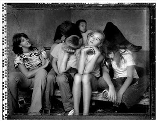
Photographer Jim Goldberg, born in New Haven in 1953 and educated in San Francisco Art Institute is a Professor of Art at the California College of Arts and Crafts. He is known for his use of image and text in a body of work he calls "Rich and Poor" from 1977-85. The work involves grouping people of different social classes in an environment opposite of their own (Rich and Poor) as seen below.


http://fotografosyotrosanimales.blogspot.com/2011/01/jim-goldberg.html

I wasn't too excited about this body of work by Goldberg. I understand the concept but I didn't feel that he sold it to me the way I think he is wanting to state it . The children in the top photo, I don't believe are contrasting enough with their surroundings. I don't see the sofa and walls to be from someone of a lesser social class's living room. I need to see more of the area. The image below this one didn't seem to fit into the body at all.

Aesthetically, I enjoyed the richness of the top photo in black and white very much. I don't think it would have been as pleasing to my eye had it been in color. However, I almost see it as a silly family portrait pose.Hummm.... there's, unity...everyones acting silly! lol.  ..shapes are breaking up the space in a good way but I'm not sold on it yet...and won't be. I think the thing I find the most interesting about the photo is the border. I keep having my eye drawn to all those dots on the left side. To me there was just no impact at all from the subject matter. I was not pulled in by the body of work. Sorry Jim.

Ruth Olivares reviews Pieter Hugo

"Hyena Men" is the name of South African Photographer, Pieter Hugo's series which portrays African people with their captured hyenas. Hugo traveled through Nigeria with street performers who had collectively used domesticated animals (monkeys, snakes and hyenas) to draw a crowd. His portraits can be the subject matter of many discussions as animal rights, outcast, economic survival and more but one thing he does ask himself is if he has the right ....
               "to question and judge life style of people who simply do not  have our luxuries."


Abdullahi Mohammed with Mainasara, Ogere-Remo, Nigeria 2007
Mallam Mantari Lamal with Mainasara,Nigeria 2005


Mummy Ahmadu and Mallam Mantari Lamal with Mainasara, Abuja, Nigeria 2005
I Find these images frightening but still wanting to take a closer look at what seems so bazzar. Pieter traveled with the group of handlers for a few weeks to get to know them and be able to document their lives but he found that portraits were the best way. When he asked them about how they felt about animal cruelty, they were puzzled by the question. That concern isn't even an issue.

His portraits are well composed but mostly the  organic hues make the images more "untamed." I am impacted by the rich skin tones and specificity of the subject more then anything. Texture is so rich that it tends to make my eye unsettled wanting to look around more to see what else I can pick out from the background or forground.  
Please check out the links below! There are many more photographs and the reading is quite compelling.


http://www.pieterhugo.com/the-hyena-other-men/

http://visualstreak.com/2007/12/09/photography-south-african-pieter-hugos-hyena-men/

His work was on display at the Yossi Milo GAllery in New York City in 2008

Ruth Ann Olivares reviews Richard Pare

Russian Photography by Richard Pare is quite animated with his chromogenic color prints!  His story telling abilities make his work even more enticing.  Pare at times enjoys telling events of his youth as a choirboy for a very large cathedral, playing music to fill the large structure and his romantic adventures as he would wonder the church building, sent on errands. He enjoys photography to the same degree. His show at MOMA.."The Lost Vanguard," portrays architectural photography and allows it to come out of the forbidden zone of art. Pare is influenced by Walker Evans and Robert Frank. His sharp images are crystal clear as well as intrigingly saturated with dynamic color.  While conceptually, he chooses to reflect more on perspective, allowing line and angle to shape his subject matter.  His choice of line use activates the viewer by drawing them into the scene and wanting more. What's around this 1926 structure?

 The DneproGES Dam and Power Station, 1999 gives the sense of a never ending hall of no return. Again perspective is at play but much stronger then before. The contrasting views from right to left of the image make the photograph a bit more interesting to  consider. The right side is cluttered and a bit busy while the right side tones down the emotion of the set recovering the eye of the viewer, creating balance. Along with perspective, there tends to be a great amount of geometric shape that shows unity and repetition. This choice of texture and composition pleases me for many reasons. I have always been attracted to line and perspective. I guess it keeps me wanting more...draws me in. I'm quite pleased with Richard Pare's work.

Sunday, November 18, 2012

Ruth, I thought you would like this. Kat

"Sweet Meet" from Jasmin Schuller

http://www.odditycentral.com/pics/sweet-meat-desserts-by-jasmin-schuller.html

Saturday, November 17, 2012

Kathryn Fisher reviews Isabelle Wenzel

Isabelle Wenzel is an artist who primarily focuses on the physical form of the human body. In 2010 Wenzel created a series entitled “Building Images” in she photographed women in awkward and sometimes seemingly impossible positions. This project is intended to be an homage to the boredom that a person can feel working in an office all day. When speaking about the project Wenzel says, “I have never worked in an office and found it fascinating to see how functional and minimal the movements of people are in such a space. It made me wonder how long I could keep sitting still.” These images are an expression of what Wenzel may do if she was forced to work in an office environment all of the time.


Wenzel’s selections of colors in her images are wonderful. The majority of the images are composed with neutral colors, with the figure wearing a lovely pop of color. I am in love with how successfully Wenzel has captured the feeling of wanting to escape, or stick your head in a bucket, after being part of the drudgery of office work. These images are beautiful, funny, and make you consider if people are really suited for office work. These photos show the strain and effort that it takes to continuously work in the same office, doing the same thing day in and day out.


Friday, November 16, 2012

Kathryn Fisher reviews Daphne Chan


Daphne Chan identifies as a boudoir and fine art nude photographer. Chan is based in New York and Vancouver. She aims to capture beautiful and artistic portraits of women. Most of her work is likely commissioned from women interested in having a boudoir photo session with her. While I appreciate her goal to make her clients feel confident and glamorous during their sessions, the end result of the photos is nothing overly inspiring. 
Yes, these women look beautiful, and I’m sure these sessions support Chan financially, but the images I find intriguing are her fine art nudes.


Her older, black and white images focus more on the full bodies of her female models. Some of these nude images seem like they are trying to abstract body-scapes, but fail to be successful as such. More often than not, the black and white images are sexual and voyeuristic. Thankfully, it appears that Chan is growing as an artist.


Chan’s newer images are still female nudes. However, these new color images are shot in settings such as bathrooms and hotel rooms. In these newer images the full figure cannot usually be seen. Because of the positioning of the figure, the images take on a quiet, yet weird feeling. It is not clear why the woman is sitting behind a curtain, or bent over a wall. With soft, muted colors the images take on a peaceful quality but are uncomfortable at the same time due to the award or unusual pose of the model. It is this ambiguity of the scene and uncertainty of the emotions of the figure that compel me to engage with these photographs.