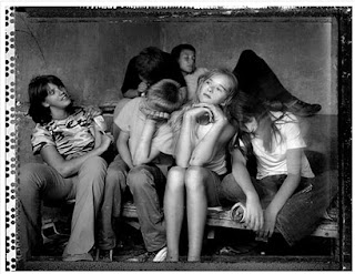
 Photographer Jim Goldberg, born in New Haven in 1953 and educated in San Francisco Art Institute is a Professor of Art at the California College of Arts and Crafts. He is known for his use of image and text in a body of work he calls "Rich and Poor" from 1977-85. The work involves grouping people of different social classes in an environment opposite of their own (Rich and Poor) as seen below.
http://fotografosyotrosanimales.blogspot.com/2011/01/jim-goldberg.html
I wasn't too excited about this body of work by Goldberg. I understand the concept but I didn't feel that he sold it to me the way I think he is wanting to state it . The children in the top photo, I don't believe are contrasting enough with their surroundings. I don't see the sofa and walls to be from someone of a lesser social class's living room. I need to see more of the area. The image below this one didn't seem to fit into the body at all.
Aesthetically, I enjoyed the richness of the top photo in black and white very much. I don't think it would have been as pleasing to my eye had it been in color. However, I almost see it as a silly family portrait pose.Hummm.... there's, unity...everyones acting silly! lol. ..shapes are breaking up the space in a good way but I'm not sold on it yet...and won't be. I think the thing I find the most interesting about the photo is the border. I keep having my eye drawn to all those dots on the left side. To me there was just no impact at all from the subject matter. I was not pulled in by the body of work. Sorry Jim.

No comments:
Post a Comment