This work didn't stand out to me conceptually when it came to the content of the photos, but the use of stacking and alt-process was intriguing and beneficial for me to look at.
Monday, January 29, 2018
Jessica Just Reviews Poramit Thantapalit
Puzzles, patterns, and assemblage are the concerns of photographic/sculptural artists Poramit Thantapalit. I have been searching for artists who work more sculpturally, as I have been working on finding different techniques in order to further a project i am working on (see below. Cubes are .5inches to 2 inches). I discovered this artist recently, after I had already began this project last semester. I have enjoyed creating something tangible for the audience to move and interact with, and perhaps this project is something that alt-process could extend into. Thantapalit's work is fragmenting the human form literally with plexiglass cubes, as well as utilizing both Cyanotype and Van Dyke for the imagery.
This work didn't stand out to me conceptually when it came to the content of the photos, but the use of stacking and alt-process was intriguing and beneficial for me to look at.
This work didn't stand out to me conceptually when it came to the content of the photos, but the use of stacking and alt-process was intriguing and beneficial for me to look at.
Jessica Just reviews Cig Harvey
Over the past semester, I have been looking at the images and readings of Cig Harvey. Her has been described to reveal mysticism in the mundanity of everyday life. Nature and family are pushed into a surreal and airy environment. Things are recognizable and melancholy, but her pairings of objects, the human figure, and color are hauntingly beautiful. Her writing is poetry. While they maintain the idea of being journalistic entries or annotations on everyday life, they are descriptive and when paired with the photographs, transformative.
In my own work, finding magic and meaning in the humdrum to create a transportational experience is important. Her use of natural light, the simplicity of the content contrasted with implication, and that uneasy yet comforting feeling you get when looking at her work is inspiring and informative to me.
In my own work, finding magic and meaning in the humdrum to create a transportational experience is important. Her use of natural light, the simplicity of the content contrasted with implication, and that uneasy yet comforting feeling you get when looking at her work is inspiring and informative to me.
BELINDA FUENTES REVIEWS SANDEEP DHOPATE
Mythical is the aura Sandeep
Dhopate’s series Elysium creates. Dhopate
explores the ideology of Elysium, the abode of the blessed after death, apart
of classical mythology. Further, Dhopate observes that in most religions, there
is a common advocating for a place where there is life after death. Additionally,
man has corrupted the journey to the after life, involving violence against
each other. Each title of each image is a sentence continuing a story based on the
ideas of Elysium that Dhopate wrote. The purpose is to draw attention to living
the life on earth instead of striving for the after life and growing in conflict
with each other.
Although all relevant to the text
[titles], the images with movement appear more dynamic compared to the more apparent
staged images, giving the text life. The color scheme is visually attracting,
glistening neon on the subjects bodies and clothing. Most of the backgrounds of
the images are deep blue, contrasting the neon colors such as highlighter yellow
and magenta.
Overall, the color scheme, subjects
and staged stories create a body of work that is a blend of the real and the surreal.


Sunday, January 28, 2018
Jessica Kolkmeier reviews Irving Penn
Irving Penn has been on my radar for awhile now, and it's because he was able to combine the worlds of fine art and editorial magazine photography, something that I am interested in. He had a longstanding relationship with Vogue, but also had several works in the Modern Museum of Art. Known primarily for his portraiture, he was able to separate his work from the rest with little more than a backdrop and a stool. His photography has a certain edge to it, catching the subject at what seems the perfect honest moment. Though majority of his photos seem to be black and white, his has still lives that show a create tonality in color, and interesting composition as well. A series of nude photos also caught my eye (not like that Libby, come on) because they seem to take on the qualities of paintings. He plays with under and overexposure, and intentional cropping of the subject.
Friday, January 26, 2018
Jesusa Vargas reviews Graciela Iturbide
Born in Mexico City in the early 1940's, Graciela Iturbide became known for her photo documentation of the indigenous population in Mexico and photos that were produced during her travels throughout Latin America. Her most familiar photographs of the people of Juchitan and of Frida Kahlo's bathroom and belongings are widely shared and discussed. However, there are some abstract, yet very intriguing, photos from her Travel Notebook series worth mentioning.
In her photo, Estados Unidos/ United States, she draws attention from the viewer towards the highly contrasting composition of dark lines and negative space created in a black and white photograph. The dark lines seem to create a simulated depth leading away and towards the top horizontal half of the image as they gather tighter and shrink the negative white space in the background. Are they cracks spreading over an arid surface or possibly dried vines that once grew and flourished as they came together at that horizon line created in the composition?

USA, 1991. Estados Unidos/United States
Another black and white photo taken in Rome in 2007 provides us with great tonal ranges and a double exposure feel that her USA photo did not have. Centered train tracks slightly curve and create a perspective that leads the viewer further away in the distance to reveal a balanced flaw in the image, perhaps a chemical burn to her film negative. The position of this reaction, top and centered edge of the photograph, works harmoniously with the overall composition. What appears to be buildings, maybe a reflection on glass of structural buildings appear exposed beneath the train track image and become more visibly detectible within the circular chemical burn at the top of the composition.

Roma, Italia, 2007. Roma
Graciela's website provides great images of her works, information on her previous exhibitions, awards, and publications. Each series is located within her titled links and her site is bilingual. Her black and white photographs have been an inspiration to my own artworks, she offers a creative and eye catching perspective of landscapes and people that anyone can appreciate.
http://www.gracielaiturbide.org/en
Thursday, January 25, 2018
Alexis Diggs reviews Hank Willis Thomas
Hank Willis Thomas
Hank Willis Thomas is a conceptual artist that focuses on themes such as identity, history, and pop culture. With inspiration from Carrie Mae Weems and Lorna Simpson, Thomas uses familiar language and imagery as a vehicle to express social issues that are often overlooked in our culture. Thomas addresses our consumerist culture in his series of work entitled "Branded" where he uses common advertisement logos and the body to create a dialogue about cultural stereotypes.
Scarred Chest
Referring to himself as a "visual culture archaeologist", he describes being interested in the ways that popular imagery informs us of how people perceive themselves and others around the world. In his other two works, Strange Fruit and Cotton Bowl, Thomas also uses familiar imagery to address identity and history in a similar fashion.
Cotton Bowl
Strange Fruit
Wednesday, January 24, 2018
Jessica Hawkins reviews Joanne Coates
Joanne Coates is a female photographer based in Yorkshire  who works with film photography and tends to have more of a documentary style to her work. She captures scenes of the everyday and uses her medium to tell their stories that tend to have an underlying sense of empowerment which comes through as she has said it is key to her practice and who she is personally. I chose to review her work because I am now working in film and wanted to see what other contemporary artists were doing with it and why they chose to pick up the older format rather than digital. According to Joanne she was given an old film camera from her grandfather which showed her that someone believed in her and her work as well as a love for the process when developing film that is missing with digital. Her photos are rich with color, character, and movement that brings them to life. It really is a documentation, but also a story that draws you in to know more.
Monday, January 22, 2018
Kelly Cuevas>Berton Van Manen
Manen is a dutch photographer that lives and works in Amsterdam, Germany. Her work has exhibited internationally and she has done many solo shows and group shows.
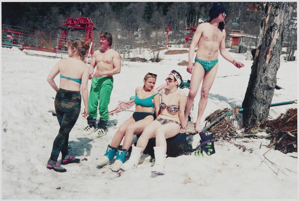
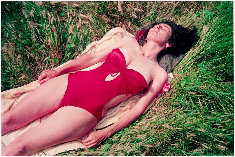
Van Manen documents the everyday life of people in their homes and doing their daily activites. Recently she has been traveling across Russia, China, and Europe. In her series "Lets Sit Down Before We Go," Manen captures the youth and lively side of Russia after the fall of the Soviet Union. I feel as though the title of the series is the perfect way to describe the photos. They are peaceful, vulnerable, and happy. She has managed to reveal these people in these small moments.
"Lets Sit Down Before We Go" is like that breath of air that you take when you make it back to the surface. It is the period of relaxation before people get up and go on with their day.


Kelly Cuevas> Edward Burtynsky
Edward is a Canadian photographer who is famous for his global industrial landscape photos. He searches for places like "recycling yards, mine tailings, quarries, and refineries" because they are "all places that are outside of our normal experience, yet we partake of their output on a daily basis." He focuses on that common problem that we are consuming all earths resources yet we ignore the after effects. Man vs. Nature. The images are reflections of "our times."
All his photos are taken from a birds eye view. He exposes and reveals parts of the world that we do not see on a daily basis. He not only shows the resources and amount of damage that we are doing to our environment, but in his "Oil" series he exposes graveyards of the transportation industries. Cars were invented to give us freedom, but there is a price to pay. The amount of natural resources that are consumed in order to make the automobile industry available to the public is devastating to the earth.


All his photos are taken from a birds eye view. He exposes and reveals parts of the world that we do not see on a daily basis. He not only shows the resources and amount of damage that we are doing to our environment, but in his "Oil" series he exposes graveyards of the transportation industries. Cars were invented to give us freedom, but there is a price to pay. The amount of natural resources that are consumed in order to make the automobile industry available to the public is devastating to the earth.

Burk Frey reviews S. Billie Mandle
S. Billie Mandle is a contemporary photographer living and
teaching in western Massachusetts, using her art to “[focus] on the spaces
where lives and ideologies coalesce.” Her most renowned series, Reconciliation, is the one I’d like to
discuss.
 |
| Untitled HF (Saint Josef) |
Reconciliation has
been exhibited both in the United States and overseas. The series consists of
photographs taken from inside confessional booths, which are small, private
rooms found inside of Catholic churches where believers can confess their sins.
Mandle was raised Catholic, and therefore has a personal familiarity with these
rooms and their associated emotions and traditions. She “[interprets] the spaces from the perspective of
the individual, focusing on the personal experience of confession and the
interiority of faith.”
 |
| Untitled C (Saint Christopher) |
 |
| Untitled H (Holy Family) |
According to Mandle, “Confessionals are places of
contradiction, light and darkness, corporeality and transcendence. I use these
visual and conceptual oppositions to question the interdependence between
tangible doctrine and intangible beliefs; I am interested in the way the architecture
of the confessional gives form to the abstract idea of penance.”
I am struck by how her compositions embody a clear authorial
intent – our gaze is very clearly directed as she wishes – while simultaneously
seeming to transport viewers into the room themselves, allowing them an
intimate first-person perspective. Mandle’s use of large format adds to this
uncanny effect.
Despite being constructed in a specific religious lexicon, I
think viewers of all religious and nonreligious backgrounds can understand Reconciliation, which explains the
series’ broad acclaim. Namely, how her camera gazes beyond the wall or corner,
looking past any subject (or at a nonsubject, if you will), imparts the
sensation of daydreaming or reflection. Even those who have never set foot
inside a church have sat in a chair, staring past a wall in hazy thought. With Reconciliation, Mandle adeptly places us
in that same chair, achieving a certain universality of expression without
discarding the spiritual context to be able to do so.
 |
| Untitled ST |
In fact, it is only with a spiritual context that Mandle’s
dingy walls and humble interiors begin to take on a more profound meaning
beyond the prosaic. Within her frank and honest survey of these spaces (she
hides nothing), a mental picture begins to form of all the confessions heard
and all the sinners who have sat here before us. Mandle takes us into a space where
“people confess their sins and ask for grace surrounded by the trace of past
confessions,” creating significance beyond the individual through a shared
experience.
Quote sources: https://www.hampshire.edu/faculty/s-billie-mandle
https://www.wipnyc.org/past/2017312-4
https://www.wipnyc.org/past/2017312-4
Jess Kolkmeier reviews Eleanor Antin
From 1971-1973, artist Eleanor Antin composed a series of 51 postcards documenting the "travels" of 100 pairs of rubber boots from California to New York. Ranging in activities from church to trespassing to hiking, to even a love affair, Antin is able to create an elaborate narrative by personifying the boots into an adventure. The final step in their journey was giving them a "room" and covering an entire gallery space in New York into their living space. The postcards were mailed out to 1000 different people around the world. Personally these really stuck out to me because I'm always drawn to work that can create the idea of human existence without actually including a model. The phrase "take a walk in someone else's shoes" comes to mind as well. I think it was a very clever and humorous piece of work, and the end gallery setting really helped tie the whole thing together.
Sunday, January 21, 2018
Gabi Cruz reviews Andreas Gursky
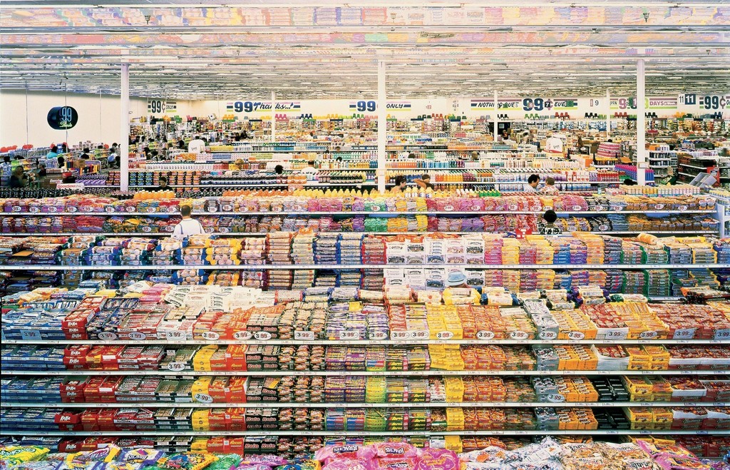
Andreas Gursky takes photographs from a high perspective and is printed at a larger scale. He captures the modern day life that surrounds us like, architecture, industries, and people, in very high detail. What I really enjoy about his work is he looks at everyday life's objects, that we over look, in a artist w ay. For example, in the 99 cent store he stepped back and composes his work to engulf the viewer with the scale, detail, and color. All the information that he captures is amazing because I just see a lot of objects that is stuffed on shelves that is overly crowded, yet, it is beautifully organized.
 http://www.andreasgursky.com/en
 http://www.andreasgursky.com/en
Susan Seubert by Augustine Chavez
I want to make some comments about Susan Seubert. Something that impresses me about her work is she doesn't limit herself to only one type of work. She has many types of work and from what is seems, she is always working. There are so many works of hers available for us to see. I think we as artist work on the subjects we are passionate about, but they many not always be successful with others so we have to keep busy by other means. I did look at Susan's work on travel, portraits, and commercial works, but the work thats feels more personal is her Fine Art work. If you go to her website, there is a list categories you can choose but the Fine Art Photography is what looks more meaningful. I am impressed with her process of work and her process on her success. I feel she contradicts what my undergrad professors would tell me about having different types of works out there. One thing is for sure, you have to always keep working. I hope to focus and study more on her printing process with her Fine Art.
https://www.sseubert.com
Jed Vasquez on Markus Jenemark
Markus Jenemark is a photographer featured on lens
culture. I will be examining one body of work titled. “Haromkring”. Haromkring is
a Swedish word, and from what I understood has two neighboring translations in
English. One definition or translation of the word Haromkring is, ` around
here`, and the second translation is, ` in the vicinity`. So, with this translation in mind let us begin.
I enjoy the strong vertical lines in all the compositions. There is a very strong
contrast in all his shots in this series. The dark's or shadows are intense, but
the highlights that are in each shot balance the composition well. The photos have an old styled look to them,
plus, in some photos I sense that I am looking at a scene in the 1940s. Because
of the chiaroscuro lighting techniques there is a dramatic effect in each shot.
In addition, by using tenebrism Markus can single out what he wants one to focus
on in his photographs. I also enjoy the silhouettes that he captures in the
trees, atmospheric perspective, shallow depth of field as well as his deep
depth of field. I assume that Markus is
not using any special effects or lens toys that would alter the reality of his
subjects. So as a result, there is a simplicity (a purist) approach to his
craft. Markus can find everyday normal scenes and have them resonate with the observer.
He makes photos that connect with others in many ways. There is a nostalgic
vibe that I get when I am admiring the photographs of Markus Jenemark. 


 http://www.mir.com.my/rb/photography/companies/nikon/htmls/models/index.htmhttps://filmphotographystore.com/
Subscribe to:
Comments (Atom)


