Monday, November 9, 2009
Sunday, November 8, 2009
Attempt to Parallel Berenice Abbott, By Barbara Justice

For the second half of this semester in Advanced Photo class, I am working off the idea spawned by my interest in photographer Berenice Abbott. She was only 31 years old when she published her book called "Changing New York". It is an extensive collection of urban photographs of all of the different areas in New York City, Queens and Brooklyn. As part of the WPA project, she was paid to document the city and its quickly growing scenery. Photographed in the 1930's this collection is pretty expensive considering she was shooting with an 8x10 camera. From a historical perspective, it is interesting to see in her photo's people and how they dressed, automobiles of that era, prices of gasoline and food. The images make me think about the progression of the times and the idea of these places still looking similar 80 years after she took on this project.
So with my project, I am using a medium format camera, black and white film. I am shooting downtown because thats where most of the historical buildings are. The technical aspects of Abbotts photos are also something I am looking at. I really appreciate her tonal variation of the photos, and with mine plan to accomplish something similar. I want viewers to look not only at the content, but also at specific printing choices that I have made such as composition, time of day, crop, direction, etc. I want to challenge myself in the darkroom and really make a perfect print with this project.
Another thing I think about quite often and have thought about with this project is the importance of us as photographers to constantly refer back to historical figures that pioneered this medium, for me looking at historical photograhers inspires new interpretations of their ideas.
Jenelle Esparza 10-8-09 Ramon Montoya III

I went to blue star this past Thursday and saw a great show at Justice Works studio. Ramon Montoya had graduated last Spring and we hadn’t seen or heard from him in a few months and then he came out with this series of images. They are a pun on the word signs put out every Sunday mass by local Catholic Churches. It is difficult to describe the artistic humor that Ramon displays. I think it is safe to say that actions speak louder than words. His printing is beautifully done and the figures look stunning. But once one realizes what the nudes are mimicking his imagery becomes hilarious and engaging. The humor might be considered crude to some standards because of its perverse nature; however, one has to set aside some reservations in order to enjoy the work for what it is. If you haven't had a chance to go see the work up at blue star you should make the trip because the card I received from the show doesn't do it justice.
Friday, November 6, 2009
Courtney Smyth 11/5/09
I wasn't able to get downtown for first Thursday (or Friday for that matter). It's playoff time in the Smyth house, lots of practices.
11/06/09 Risa on Ramon Montoya III's Diptychs
Sunday, November 1, 2009
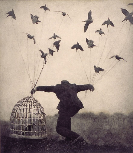
Alchemist II- Jennifer Williams 11/01/09
 Alchemist II is a photograph by Robert and Shana Parkeharrison. The couple work together with sculpture, paint and photography to create images that are dreamy and surreal.... a bit dark. Their imagery is a commentary on how humans effect nature, and/or how humans are affected by nature and/or industy.
Alchemist II is an image of a man who is tangled up in wires that are plugged into the wall. The wires are plentiful, they easily overwhelm him. They seem to be causing his death, or at the very least unconsciousness. He hangs from the wires that have overtaken him, wrapping around his stomach, arms, and neck.
It seems obvious that the man in the photograph did not do this to himself (it would have been unnecessary to wrap them so many times, so sporadically), but that the wires, the energy of industry, the electricity have themselves hung him. They have taken on a life of their own, and stolen the life of the human.
The Parkeharrisons are asking us to think about industry and development. They suggest that our world of electronics that is ever-growing is perhaps a danger. Where does it stop? Will we indeed empower them? Will they overtake us? These are important questions for our generation, and they have a beautiful way of bringing the issue to light with images that although disturbing, are visually pleasing. The colors, the painterly feel, the impeccable composition and well-controlled light all make their images feel beautifully dreamy. And yet, they are so much more than just a pretty picture.
11-1-09 Brittany Gates - Mark Hemmings

I stumbled across Mark Hemmings website the other day and was really impressed by how diverse his work is. He does both fine art and commercial, and ranges in everything from high fashion mannequins to snow monkeys.
I spent a lot of time looking at his mannequin photos. Hemmings says that he had nightmares about mannequins as a child, and those memories prompted him to start this series. The one above is my favorite because of her posture. The way she holds her hands makes her look like a criminal mastermind, planning some sort of evil deed.
This was one of the few faceless mannequins that he photographed, but I think it is better because it is faceless. It makes it a little more ominous.
The lighting helps too. The background is so dark that you can't even tell if the mannequin has legs or not. She appears to be floating in space, like a ghost.
You can see more of his work at his website.
Courtney Smyth 11/1/09 Robert and Shana ParkeHarrison
This week I looked up Robert and Shana ParkeHarrison. You can find their website www.parkeharrison.com. Their images are divided on their website into three groupings, one of which is The Architects Brother. This is the set that is most intriguing to me. They each sort of remind me of DaVinci's drawings of fantastical machines. Only ParkeHarrison's seem like the experiments gone totally wrong. The photos are very interesting, and seem like you could get tons more info if you could see them large. This series has sort of an old fashioned feel to it. They appear to be in a foggy or misty place, adding to the mystery of each shot. Many of them also incorporate in some way nature, or at least nature in a strange, compromised way. The ParkeHarrisons seem to be playing with the idea of man connected to nature, man trying to manipulate nature. Some of them remind me of Tim Burton movies, like Nightmare Before Christmas. They have a spooky, eerie feel. I found a blog that says they only do 10 prints a year. They do everything by hand, the old fashioned way. They sometimes add paint and bees wax to the final prints. They make all the props and sculptures themselves, and Robert is the character in the prints. I would love to see these up close!
11/01/09 Risa on Dan Donovan
http://dandonovanfineart.com/#/client/template.xml?aaa=portfolio/11943
11/1/2009 Jenelle on Ansen Seale Photography


Ansen Seale is a local San Antonio photographer. He is going to be on campus in two weeks to critique Larry’s class (yikes!!!). His photography is amazing, particularly his Temporal Form series. He uses something called a slit scan technique to create his images. They take the viewer into another world visually. They bring about the idea of time and space; the images seem to go on forever. The figures are floating and transforming. The movement of the figures twists them into grotesque yet beautiful shapes. The black and white skin tones create a landscape of flesh as it stretches across the black background. I enjoy seeing the nude figure portrayed in this unique way. If anyone wants to view his portfolio, google his name and his website will come up. Good stuff --jenelle