Thursday, July 31, 2014

Nadia C. Gonzales - BLOG 05 - Jeanette Barnes


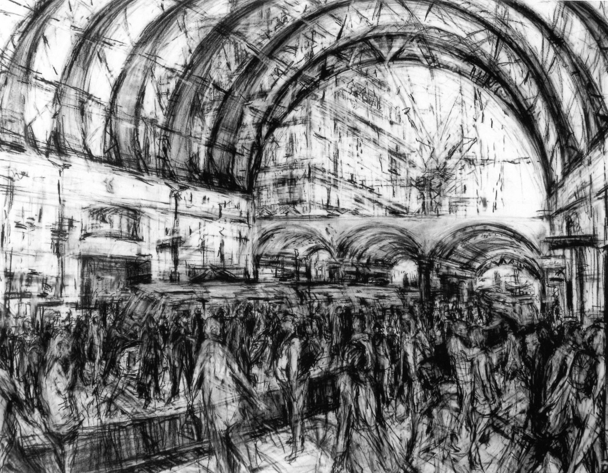
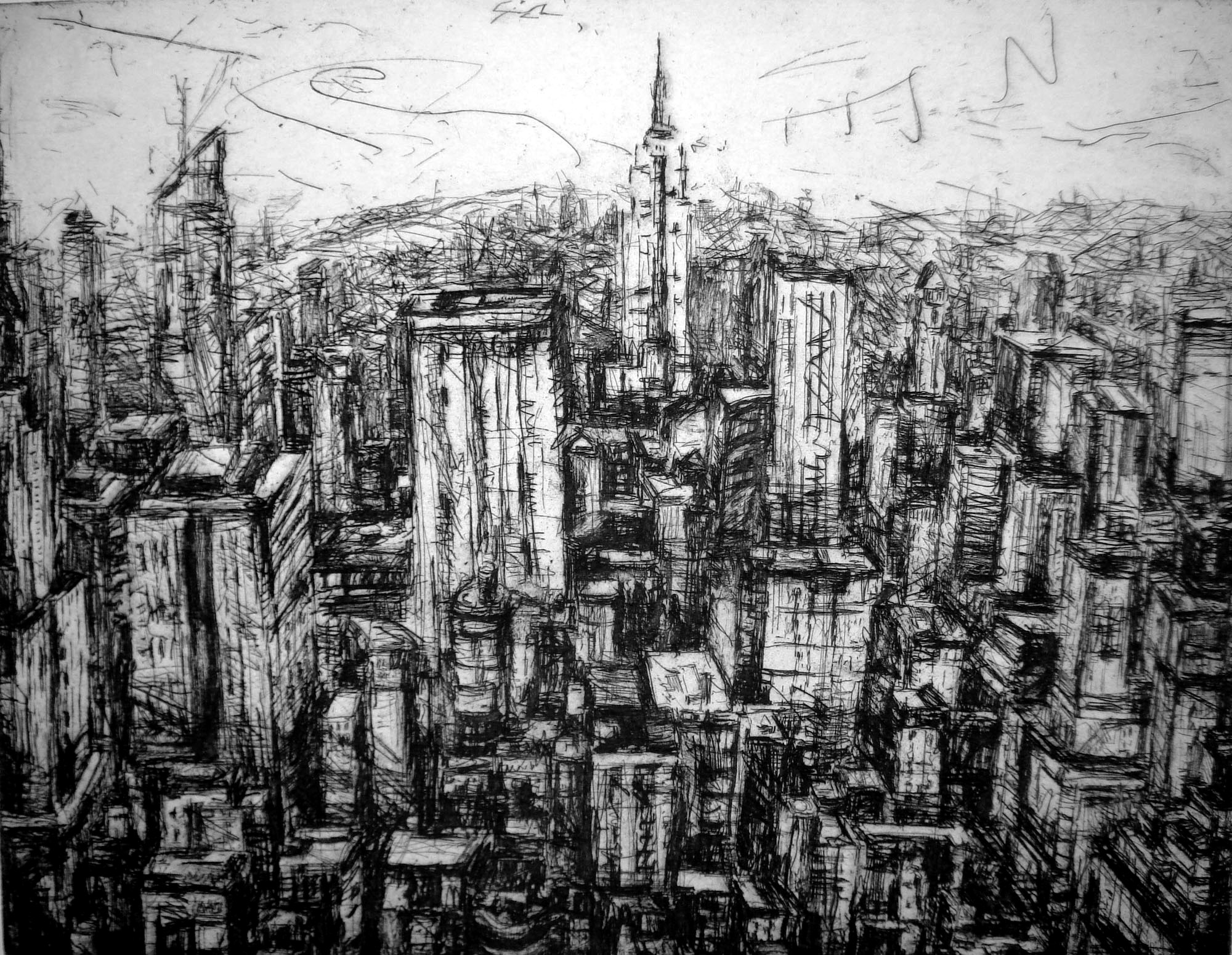
At first glance Jeanette Barnes' scratchy visually complex drawings can give the viewer a bit of a headache. There is a crazy amount of imagery to look at all in one time. But I've noticed when I step back and fully look at her art as a whole instead of the many individual lines I start to appreciate it more and come to love it. She has a smart way of using line to create motion and noise. The majority of her drawings are that of a city landscape exactly where the most noise comes from. The people don't look frantic either. It seems they should since there is a repetition line work in each of the figures, but Jeanette does just enough to keep it from becoming too chaotic.

I was referred to this artist from a friend of Libby's on Facebook and I'm glad she was brought to my attention. The critique of my drawing style is the complete opposite of hers and I believe to be a great artist we should try many different art styles we are able to whether we necessarily like it or not. I understand that I have to "let go" while I am drawing although that is more difficult than it seems. I appreciate that Jeanette does not lose the point of perspective on her pieces so that there is still a good amount of dimension. She uses thicker lines to create shadows instead of blending everything in. Not being able to blend is my biggest obstacle since I've started to experiment with this style.

In the drawing below I love how she leaves some things unfinished so that our imagination can finish the rest. For example the building is not anywhere near complete but it doesn't really matter because we can finish it ourselves. Not paying attention to every tiny detail is what makes this so effective. I feel if all the information was provided these works would not be nearly as interesting.

Nadia C. Gonzales BLOG 04 - Diego Fazio

Diego Fazio is a self taught photorealist artist who's work has most recently become well known on the internet thanks to Deviant Art and various websites. I found him from she popular pop culture news app BuzzFeed. He was featured in an article and is quickly developing a fan base for his amazing portraits. Hyperrealism portraits are extremely difficult to achieve because every detail has to perfectly replicate the photo that is being referenced. Any slight difference even the tiniest of detail can possible throw the end product off completely. I have only attempted once to draw a portrait exactly like a photo and it took a very long time with an extensive amount of focus and discipline. Having going though that process personally I have an enormous amount of respect for his work. Although it may not be as conceptually interesting to some I believe this is where the talent aspect should be paid attention to more so than the context. He has mastered the technique of chiaroscuro contour and highlighting so much so that there is no indication of any pencil markings. I feel like this is what makes the drawings so successful and is only mastered with an extensive amount of practice. Something that might be more interesting is if the subject matter was photographed personally instead of a celebrity or copyrighted photo. Regardless his keen eye for detail  draws me into his pieces and I would absolutely love to see them in person because a computer screen does not do any art work any justice.


Nadia C. Gonzales BLOG 03 - DANIEL SPRICK

Since I've been taking this summer color theory class with Vikki I have become so much more conscious of color relativity and purposely using colors to evoke different emotions in art. Even changing the background from blue to red can change the piece dramatically and have a different effect on the brain and our natural response to it. One artist I believe that  uses color relativity effectively is Daniel Sprick. I often use him as a reference to my projects because I feel he knows exactly what he is mixing and his decisions to use certain colors work very well to produce great paintings. He uses a lot of natural lighting in his pieces so  often the lighting in his paintings is more of a yellow, blue, and/or green tone. His style is very clean and realistic which is something I love because it takes an immense amount of work and technical skill to achieve. In addition to painting his subject matter true to form he is excellent in the placement of his compositions so that they are visually interesting.
There is often and oddball object that does not seem to fit in the setting but it's not too much that it becomes distracting. I feel that he pays special attention to every detail and that's what makes his paintings so visually and conceptually great and overall well executed. Everything has an intention and every object is carefully paid attention to.


Nadia C. Gonzales - BLOG 02 ORLAN


One of the most intriguing artists I have researched is Orlan. She is definitely a one of a kind artist who took her art to a new frightening level. During the course of 1990-1995 she underwent 9 plastic surgery operations to alter and imitate her facial features of influential women in famous paintings. The most noticeable surgery she received are the implants on either side of her forehead that are supposed to mimic the Mona Lisa’s prominent forehead. Most critics call them “demon horns” as they are unnatural and very strange. However, in response to her critics she accentuates them by putting glitter and drawing more attention to her “demon horns”. This small action speaks volumes to me because instead of shunning things that aren’t’ necessarily beautiful in society’s idea of beauty she glorifies them.  I appreciate her work as a radical artist and her message about feminism, religion, sexuality, & DNA. Instead of going the tradional route and painting a woman’s genitalia she decided to alter her body in order to get her message across. When I first came to school I was not a big fan of artists who took their ideas to the extreme as Orlan has but as my time here has gone on I have opened up my mind to new ideas and fully realized arts importance in society. I’ve fully realized that art is so much more than beautiful paintings on a wall and great art is art that has a strong stance in something bigger and being able to execute it correctly in order to get their point across. I probably have realized this later than my peers but at least I got here.


Nadia C. Gonzales - BLOG 01 N.C Winters


I found this amazing artist on Instagram a couple of years ago by accident. Although he is not that famous yet he has sold many prints and he primarily posts most of his work on Instagram instead of his website. N.C. Winter’s artistic style is something I envy because it embodies everything I would love to do and hope to achieve. The works are mainly portraits with a surreal twist. They often include people with sinister expressions and/or profound emotion. The subject matter is always in the middle like an old fashioned portrait although it is very far from being traditional.  The color palette he typically uses is vintage, dull, muted colors that give his work an antique look. There is so much attention and intricate detail done in each of his paintings and drawings that it reminds me to be patient with my own work so that the end result is as a great as it can be. I especially love the airbrushed look he creates because it gives a polished refined appearance which is very pleasing to the eye. His older works are slightly commercial compared to his 2014 collection. It is apparent his style has evolved and he tapped into a deeper conceptual mindset to really push his ideas and ultimately make the artworks more interesting. That is something I have struggled with since I realized I loved making art. I hope to achieve this in this class so my art can be fascinating and have substance along with technical skill.


Wednesday, July 30, 2014

KHANA 05 REVIEWS ANDREAS GURSKY

I first came across Andreas Gursky back in 2011 when Yahoo! News brought it to my attention that a photographer sold his painting at auction for $4million. Umm...what? How is that so? Let me check this Andreas Gursky out.

http://www.npr.org/blogs/pictureshow/2011/11/15/142342119/meet-the-worlds-most-expensive-photo-part-ii

I had forgotten all about him until I was reminded of him the other day. Me being interested in large-scale photography and printing I came across him once again.

"Andreas Gursky makes large-scale, colour photographs distinctive for their incisive and critical look at the effect of capitalism and globalisation on contemporary life."

Looking at his works on whitecube.com I was astounded at what I was directed towards. The quote below his photos states he makes works as a "critical look at the effect of capitalism and globalisation...." but at first glance I did not notice that. I was mesmerized by the arrangement of the objects in the piece. His "eye" and arrangement of the photographs is what makes it compelling. In a majority of the photographs, the foreground overpowers the background and sky but with the little room he leaves for the piece to breathe it seems to be a perfect balancing act between space and weight.

It is amazing how he creates these aesthetically pleasing compositions of his photographs and the dynamic colors created/present. Some of the photos (Greeley) almost even look fake or if a tilt-shift lense was used.


KHANA 04 REVIEWS KENDA NORTH

"Being underwater is a state of buoyancy, fluidity and weightlessness. Unlike the open sea, water in a pool offers an ambiguous spatial depth with a color range from indigo to cerulean. The figures in these images emerge from the blue field surrounded by fabric and tulle. The color blue is a mindset for me, it speaks of desire, daydreams, blue gestures and blue thoughts. In this state of being submerged, we are brought to a place of sensory awareness and uncertain reality. Color, reflections and the confusion of materials and figure produce a world both mysterious and defined by light."

The part in the quote where she speaks about being brought to a "place of sensory awareness..." and the color ranges from several blues and greens is what I noticed first about her "Submerged" work. Not necessarily to the that exact precision but the thing that brought me in immediately was how I knew it was a person in a pool but it resembled a painting. Almost photorealistic in a sense, the way the colors from the surface interact with the color of the water and mix and change.
Not only that but the way she positions and crops her image makes it much more compelling; how she is able to play and incorporate with the reflection of the subject just under the waters surface and consider that into the composition.

I'm familiar with works underwater in pools and have seen several artists go this route, but I do believe that Kenda North does it the most successful. It makes me as the viewer know its a pool but also has me disregard it and see it in a different light as well. A way of slowing down time if you will and have the viewer analyze motion and how things come to life. I enjoy seeing different colors incorporate into the wardrobes of the subjects along with the depth of field and color of the water.


Thursday, July 24, 2014

Bianca Review- 03- Laia Abril

While researching artists for my curatorial debut, I discovered Laia Abril. She is a Spanish artist that grew up in Barcelona and her work is mainly documentary. The project I am working on is shedding a light into what strangers find they don’t like and like about themselves physically. A contemporary idea: Body Image, everyone faces them these days whether through bullying or in the comparison of oneself with the media. Laia Abril took the idea of re-introducing the viewer to Anorexia in a new way, through the eyes of its fans.
            This is a close and personal subject to me, after having met a girl who suffered from Anorexia. This girl had the hardest time being normal because this disease overcame her body and mind. These “Pro-Ana” websites are also real, and very terrifying because people encourage others to continue with the sickness that ravages them. Laia Abril retakes self-portraits from the screen she views them off of.

            The images are of girls squeezing in their stomachs, measuring their wrists and arms, standing up or lying down. The images are haunting and ghostly because the subject looks as if they could just disappear anyway. All of these women are dressed in hardly anything and seem to be almost proud in their disfigurement of their bodies. The idea that their bodies are not thin enough, or not perfect enough goes racing through their minds. And even though the images are only of women, men also experience this disease though it is not as popular in the media.


Bianca Review- 02- Amy Theiss Giese

I couldn’t contain my excitement when I found this artist experimenting with paper, chemistry and light.  The idea of using the basic materials of a photograph in a dark room to create a photograph without even taking a photo is exciting.  It’s a contemporary way of using most people no longer even think of because of the new digital age.

Amy Theiss Giese uses no camera to create her bodies of work but instead the fundamentals of a darkroom: light sensitive paper, chemicals, and light. In essence she is taking photographs of the shadows in the darkroom that are briefly seen when you turn on the enlarger to capture the negative from a film onto paper. As we know light also has different spectrums of colors which are naked to the eye. These create the different tints of color onto the paper. These pieces of art create window to a parallel world we cannot see until now.


 Her body of work also makes the equipment in the darkroom the most important aspect of the process. Though the images from “Concealed at first at last I appear” are not her first experiments in Photography, they are by far the most interesting in my opinion. The genius that is to not necessarily photograph the shadows of the dark but more to capture the essence that is a shadow. It makes those eerie figures you may have once been afraid of as children come to life. Her images also have a creepy effect to them as well giving the viewer a sense of slight fear while viewing them.


Wednesday, July 23, 2014

KHANA 03 REVIEWS ROBERT AND SHANA PARKE HARRISON


 "We  create works in response to the ever-bleakening relationship linking humans, technology, and nature." Would viewers be able to pick up on this element without knowing this? I believe so. Not necessarily to the exact idea as that, but there is a certain element to their photos and subject matter that one picks up when seeing their works. They have several different collections to look through but there is a constant element maintaing throughout, whether it be the message or their unique "style."


"Their newest series, Gautier’s Dream, marks a return to b&w imagery that reveals their love of opera, dance and cinema. Inspired by French artist, writer and critic, Théophile Gautier, these new works explore dramas that unfold in front of an audience and behind the velvet curtain. Their Everyman, once obsessed with saving the earth, now breathes in the earth, his face inhabited by sunflowers and daffodils (The Lover); becomes a collector of moths/butterflies by listening to them (Thief of Paris); and turns into a willing puppet, dressed in a top hat, awaiting his grand entrance (Apparition of Mallarmé)."


With a new approach to photography this semester and attempting to freshen things up and practice techniques and ideas I am not familiar with/explored, looking at their work, I can appreciate more their attention to detail and the scene they are setting up. I remember seeing them at the Artist Talk at Trinity 4University earlier in the year and their use of surreal colors and overall "look" of their photographs were amazing. Some have simple subject matter at first glance, but after you stop to look at it you are pulled in by their ingenuity in the subject matter and the method they present it in. Their works have an "aged" feel to them in most of their collections, but more so in their "Architect's Brother" series.

In the piece "The Source" a man is seen coming out of the ground/standing in a hole with his back turned towards the viewer and on his head is what appears to be a bush/tree of some sort. Not in a pot but instead just free formed with the roots falling every which way off his head and in his hands he is holding a glass of water-pouring onto his head and roots. 

I was going to address another photo in another collection of theirs pertaining to trees coming out of the subjects forearms but came across "Wound" in their Gray Dawn series. Extremely compelling- the photograph is that of a tree limb stretching across the piece and in the middle is a bandage around the tree. It looks as if the tree itself has been hurt and is bleeding from the wound into a glass that has been tied to the branch to collect the blood. Their delivery of the photo in the means of their editing the photo/developing the piece is so successful in making the content a lot stronger than if say it were to be printed onto a clean glossy white piece of paper 


Monday, July 21, 2014

KHANA 02 REVIEWS TODD HIDO

After having presented my concept of ideas I would be working on this semester and my one on one meeting with Libby, she recommended I researched this artist. The home page of his website is neat in appearance and to the point. For example, you type in his URL to his website and there on a somewhat off colored squares with three lines of text: his name followed by two hyperlinks directing you towards the photographs and collections and the other directing you to information of the artist.

After having done some research and perused through his work I came to really enjoy his "Homes at Night" collection. His use of lighting and the natural lighting makes the scenes almost look like that of fantasy. Looking throughout his compositions and observing the lighting on the streets and how well each section is lit and the ambient light compliments the light coming from the persons windows.

My favorite photo of the collection would be "2479a." The mixture of the lighting is not only interesting but engaging as well. For example, part of the photo has a harsh white light coming in from off scene but blends in with a softer more brownish orange/red light coming in from the right of the photograph. Moving the viewers eyes throughout the composition, the windows serve as another visual area to draw your eyes to. Some of the windows are filled with a harsher yellow light, more distinct, while the other windows are filled with that softer red light. Theres a mixture of similar colors that are spread throughout the photograph that make it engaging for the viewer and pleasant to look at. After looking at the foreground and subject matter (the house and windows) one moves their attention toward the sky which is just as equally interesting as the foreground. There is the same variation of colors and battle for attention that the colors are trying to achieve. Overall his photographs and skills are something to aspire to. His use of lighting and control over the ambient light as to not make or break the photograph if I may, but Todd Hido uses it in such a manner that elevates the composition and photography to another level


Saturday, July 19, 2014

Bianca Review- 01- Ying Ang

I want to expand my knowledge of photography used in a contemporary setting this semester. I was confused as to what I could create my body of work on this semester so I wrote out four solid ideas in which I could follow. The idea of a beauty shot always fascinated me but by taking macro shots of what people liked and disliked about themselves, brought the idea into a more contemporary setting.

 While looking for artists whose works interest me, I stumbled upon Ying Ang. Her works mainly consist of social and contemporary issues. Ying Ang's interests lie in creating something you can read and hold onto whether it’s for print, on the web, or an installation. She is based in Melbourne, Singapore, and New York so many of her bodies of work have to do with the cultures of the area.


In her newest book, Gold Coast Book, she captures the dark unseen side of the Australian Coast. In her series, there are portraits of the young and corrupted. She also photographs settings in which the tales of rape, drugs, murder and extortions are based upon. Her photographs are inspiring and pleasing to the eye, which give you a glimpse into another world that most Americans consider paradise. When I see her artwork I am inspired to look at the lives around me in a new perspective: the real truth behind the people, or at least pretend like I can see another perspective of the lives around me.

http://yingangphoto.com/index.cfm