Wednesday, September 29, 2010

Thomas Lopez Submits Philippe Mazaud

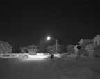
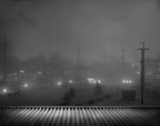
Philippe Mazaud‘s work titled Nocturnal is a visually striking collection. In this work he is trying to capture the star effect that late night scenes can have. He compares them to a scene in a science fiction movie or traveling into some alien world in which life was absent or had been removed. This is how this series began. Now since he has started working in large format he describes them as having a set like quality, in which some plot seems to be unfolding. It is the absence that he is playing off of.

I feel while many of the photos are quite beautiful and are portraying the message he is trying to capture there are many of the images that just don’t seem to have this effect.

In the photo titled Curtain (Fog) I feel it is close to what he is going for. In the work titled surf I feel this piece also depicts the message he is looking to portray. In his piece titled Cold Light, while having a beautiful quality I do not see his message coming across.

Many of the photos capture the light and shadows quite strikingly and seem to be very nicely processed, however there are a number of them that just seem quite boring even though the quality is good.

After looking at this series I was looking at another series he is working on called Logan Garden. This series while having much fewer images I feel seems to hit the mark of what he is portraying better then the Nocturnal one.

In the Logan Garden pieces he is playing off of some of the themes that have shown up in art over the ages. I feel many of these do this quite well, for instance in the piece Balcon as well as in Italian Holiday.

ItalHol icon3Balcon icon3

http://www.philippemazaud.com/SurlHerbe.html

Tuesday, September 28, 2010

Carolyn King submits Justin Vinesky


Man, he had me til he said this...
"[Justin] makes photographs of the simple, quiet times in life; taking the ordinary and making it something more, something for the keeping." Blah. Go buy a scrapbook.

Well I did enjoy about half of the work in Sometimes You Just Know because, well, sometimes you just know. Sometimes you just live in one second and know that things are alright, or not right at all. I felt more connected to the meaning behind this project than the actual photos; the feeling of just being and feeling and knowing something with a sense other than sight is pretty universal and I know that it's something I feel about every other day. I think I enjoy this project so much because it's something that I feel I've struggled with comprehending, not knowing how to deal with the feeling of just knowing that something isn't okay, or otherwise. I've been brooding and dwelling on feelings that come to me from nowhere and the harder I try to give them definition, the more I struggle to understand their origin. Seeing that someone can comprehend it through photography gives me a little slice of calm.

http://www.justinvisnesky.com/

Carolyn King submits Christy Karpinski


I am still trying to figure out why, but the photos in Christy Karpinski's project, Formations, make me a bit angry. Maybe not angry but at least a little annoyed. Karpinski uses an extremely shallow depth of field throughout the entire body of work, focusing on the foreground, which is some sort of object that is holding the attention of a young child in the background. After the third or forth image I started to feel uneasy about the DOF and tried to justify its use. What I come up with is that Karpinski is trying to focus and highlight the moments or objects that create a child's "formation" of the world they live in. I may only speak for myself in saying this, but as a child, my world wasn't made up of a tiny patch of grass under my feet; I lived in a world that was a sea of green that was made up of my entire backyard, and the side yard that spilled over into the neighbor's lot up until it hit the cement of the street that ran a block until it reached the grass of my friend's house down the way. Perhaps I'm reading this all wrong...which is okay, because it reminds me that our work has to speak for itself when we aren't around to give it a voice. I guess I'm annoyed when I look at Formations, because the only thing I'm wondering is..."So what?"


http://www.christykarpinski.com/index2.php

Carolyn King submits Mark Peckmezian


Mark Peckmezian is a Contemporary Canadian photographer working out of Toronto. He is currently working on his BFA at Reyerson University. I enjoy his portraiture work because he employs mostly available lighting and I feel that this gives a true and intimate insight to the life of the subject. Many of his photos remind me of Ryan McGinley's I Know Where the Summer Goes, conveying a playfulness that is prominent in the social scenes of students and young adults. On his website he differentiates his work between "Photographs" and "Pictures" which I find interesting because I feel that mere "pictures", can be considered a special type of photograph, and shouldn't always be so quickly dismissed as lucky or clever captures of time. They too can be viewed and even appreciated as artwork and I think they can be critiqued as such as well. His "pictures" which are quaint and goofy, are often blurry, out of focus, improperly exposed or even sillier (but awesome at the same time) displayed as test strips, with obvious gradient changes throughout the image. Though not very experimental, his "pictures" demonstrate that Peckmezian has a keen eye and unique compositional strengths. The thing that I gained most from viewing his website and reading his mini bio was that
just because we are still "students" doesn't mean we have to keep our work shut up inside of portfolios that we don't show anyone. Rather we should be bold and submit our work wherever we can and start marketing ourselves because no one is going to do it for us.

Can I get a big "like" button?!
http://www.markpeckmezian.com/index.html


Sunday, September 26, 2010

Salina Ellis presents David John Lotto


I found this artist while doing research for my self portrait project. Lotto is a self taught artist who has long worked with platinum palladium process. This process is said to have the greatest tonal range of all photographic processes. He uses vintage and soft focus lenses and a 20x24 view camera to capture the images and prints on Japanese paper. Recently the artist has begun exploring use of wet plate collodion. Because the collodion creates a single positive, Lotto scans the image into a computer to further alter and reprint. The artists work explores themes of emotions, psychology and spirituality.


He creates work in landscape, portraiture, figure, and still life. I was first drawn to Lotto's work by his use of the figure in his imagery. I love how he is able to create work that is both ethereal and textured at the same time. Especially beautiful are his wet plate pieces. The unrefined edges and occasional distortion within the image imbue the pieces with a feeling of history and nostalgia. Lotto’s use of light adds more dimensions and emotion to the environments he creates. He asserts that his work helps him to understand and come to terms with self. This philosophy of work agrees with my own personal approach to creating art.


Friday, September 24, 2010

Yvette Coronado submits Dulce Pinzon


Dulce Pinzon is a smart Contemporary Latina photographer. She was born in Mexico City in 1974 and moved to New York to study at The International Center of Photography in 1995. Her focuses on the Mexican immigrants that thrive among the New York City landscape. Pinzon's website features three of her series, People I Like, Superheroes, and Multiracial. These series are diverse, clever, and well crafted.
In The two series People I Like and Superheroes, Pinzon approaches her subjects of Latinos in two different styles. People I Like is a series devoted to portraiture, Pinzon captures Latino eccentrics with simplicity and grace. Light is an integral part of the series. The plain dark background showcases the subject as the light softly illuminates them. Within the light the subject is truly revealed and a strong sense of drama is created. Superheroes documents the immigrant in their everyday work situations.The twist is that the artist sees them as superheroes and has them dress up as different heroes. The artist is paying homage to all the hard working immigrants that manage to work legally and send money back home to their communities. This series' costumes and background settings are the essential elements that showcase the subject. Pinzon creates a sincere vision of Latino immigrants.
Pinzon's photography can be seen at her website http://dulcepinzon.com and some of her work is currently being shown at The Guadalupe Cultural Art Center's Fantasic Fuerzas show.


Tuesday, September 21, 2010

Andrea Couture submits Ellen Carey

Ellen Carey is a contemporary photographer who works abstractly. Many of her photographs can be mistaken for paintings but are actually made inside the camera or darkroom. She does use paint sometimes to paint over specific areas of some of her photos but she also uses the inks found in large format color polaroid films.
In Carey's series Photogenic Drawings she uses the darkroom as her camera by making photograms. For this series she worked in both color and black and white. While I do not know exactly what materials she is using to create these photograms, I do think that they are very interesting. She is able to get a lot of depth (especially in the bottom image) and texture in each piece. The photo on the top reminds me of what looking through a microscope is like. All of the small circles and textures reminds me of cells and other microscopic material. I really enjoy both of these compositions along with many of the others from this series.
She also has a series of self portraits which could maybe help inspire someone for the next project?
Here is her website:

Sunday, September 19, 2010

Courtney submits "China's finest contemporary photographers" 9/19/10

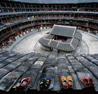
While waiting for my film to dry on a weekend visit to the darkroom, my son (Pete) and I decided to check out the show in UTSA's gallery. It's called "Images Speak to the World: Today's China". Lucky for us, this is the only U.S. stop for this exhibit. There are about 75 photos in this collection. All are approximately the same size, framed in similar frames. The subject matter varies-natural, historical, architectural. Actual humans are strangely missing, not seen in any of the photos. The photos were taken by a conglomeration of "the country's finest contemporary photographers". I know it's China...but it still seems strange that they aren't able to label their own work with a name.
The show was, on the whole, visually beautiful. The colors in the photos were stunning, almost not realistic looking. They are very formal and documentary like as far as style. I did not find the photos all that interesting, none held my gaze for long. They are very symmetrical, and centrally focused. I am always drawn to architectural shots. I love the linear quality and different perspective. The ones that I found most interesting were the ones that had evidence of human life (like the one pictured here). Some had glorious scenes of mountains with a tiny hut on a cliff-giving the viewer the sense of grandeur. It is also fun and interesting to get a peak into a culture that is so unfamiliar and sometimes strange.

Thursday, September 16, 2010

Jason Salavon takes photos from magazines, news papers, and other popular culture materials and merges them together. He has a several series on which he has used this technique some of which are The Every Playboy Centerfold and Homes for Sale. For Every Playboy Centerfold he chooses the centerfold photos from magazines from each decade. In Homes for Sale Salavon took photos from a real estate magazine and blended them together. Once he has chosen all of the photos he wants to use, he puts them in a computer program that he created. Here, he averages the colors so that all the photos have the same general tonal range. Then he layers the photos on top of each other.
I feel that Salavon has an interesting concept for his work. By blending the images together he is able to show the similarities between some of the subject matter - such as, thePlayboy models that all seem to have the same build, hair color, and length of hair. This shows that the things we see every day are very similar and the merging together of the photos represents the blur of life passing us by.

Here is his website Salavon:

Sunday, September 12, 2010

Brian submits Jimmy Chin


Some of Jimmy's recent assignments include photographing the cover story for Outside Magazine of Stephen Koch's attempt to snowboard the Direct North Face of Mount Everest; traversing the Chang Tang Plateau in northwestern Tibet with Rick Ridgeway, Conrad Anker and Galen Rowell, shooting video and still photography for National Geographic; and climbing the world's tallest freestanding sandstone towers while shooting for The North Face in Mali, Africa. In the Spring of 2004, Jimmy climbed Mount Everest with David Breashears and Ed Viesturs, while shooting the documentary video and production stills for a feature Universal Studios film. In the Fall of 2006, Jimmy made his second ascent of Mount Everest and skied from the summit, making the first American ski descent of the peak.

As a photojournalist, an adventure sports photographer and sponsored North Face Athlete, Jimmy has the physical and technical skills to shoot subjects few others can approach. His versatility as an athlete provides him a unique understanding of the sports, the people, the lifestyles and the expeditions that he photographs.

Rewind to 1999, before he became the most sought after expedition photographer, before he even purchased his own camera. Chin was training in California's Yosemite Valley for an expedition to Pakistan's Karakoram Range. After a six-day climb of El Capitan, Chin picked up the camera of his climbing partner, himself a budding photographer.

"I had woken up early with the morning sun and took a photo of Brady sleeping in his bag next to all of the gear we had strewn across the ground," Chin said. Out of the entire roll, the frame shot by Chin was the only one that sold.

Chin used the proceeds to purchase his first camera. The rest is history.

I appreciate fact that he began little-to-no technical training but merely an outdoorsman who discovered he had a great natural eye. Gives us other Asian outdoorsy kids hope.

http://www.jimmychin.com/

Saturday, September 11, 2010

Exhibition Opportunity: TPS "Best Shot"

Best Shot

A Members' Online Gallery and Fraction Magazine Call for Entries


The Texas Photographic Society is hosting an online exhibit with Fraction Magazine. Juror and Fraction Magazine Editor and Cofounder, David Bram, will select images that he would like to represent in an issue of Fraction Magazine. First, Second, Third Place and Honorable Mentions will be featured in the January 2011 issue. TPS is inviting amateur and professional photographers to submit digital files of their color and black & white works to TPS by October 13 for Best Shot online competition. The Best Shot will also be exhibited on our Members' Online Gallery for a month and archived for a year.

About the Juror

David Bram
Editor and Cofounder of Fraction Magazine
Albuquerque, NM
www.fractionmagazine.com

David Bram is a fine art photographer and the editor, founder, and curator of Fraction Magazine, an online venue dedicated to fine art photography, showcasing the work of both emerging and very established fine art photographers. Fraction Magazine is now published on a monthly basis. Fraction Magazine was founded in 2008 and is currently on it’s sixteenth issue and has shown portfolios from more than 85 photographers. Mr. Bram has been reviewing portfolios at various events including Review LA, Review Santa Fe, PhotoNOLA and Fotofest. He was also a juror for Review Santa Fe in 2010 as well as a juror for Critical Mass in 2009 and 2010.

Calendar of Events 2010
October 13
Entries due in San Antonio

October 14
Entries sent to David Bram

November 12
Notification to accepted entrants posted on the TPS website, www.texasphoto.org.

December 1
Show opens on the Members' Online Gallery.


Rules and Guidelines:
You do not have to be a member of TPS but you may join at a discount when entering the show. The entry fee is $15 for 5 images. You may enter as many times as you like.

To send entries via email:
1. In the body of the email, number each image so that it matches the numbering system according to the files directions below. Be sure to include the title of each image and an artist statement if entering a series or project. We also require contact info, your name, address, city, state, zip code and telephone numbers.
2. Files should be 1000 pixels in the longest dimension saved in the JPEG format on high quality setting (not maximum). Images should be sampled at 72ppi and saved in the sRGB color space.
3. Label each file with consecutive numbers followed by your name. ie 1SamJones, 2SamJones. Also, from a networking standpoint, do not use spaces in the title of the JPEG (use underscores if needed) and limit to only alpha-numeric characters (do not use :.:’”/?}{()[ ]+-=*&^ %$#@!.).
4. If you chose, you may send the credit card information from our secure website: http://www.king-cart.com/cgi-bin/cart.cgi?store=TPS&product=BestShot10Fee&exact_match=exact. Or you may include a Visa or Mastercard number along with the expiration date, and 3 digit security code in the email.
5. Email files to Shows@texasphoto.org.

Reproduction
TPS retains the right to display, project and reproduce work accepted for this exhibition for publicity and promotional purposes only. Individual photographers retain Copyrights to their individual works.


Eligibility
The exhibition is open to amateur and professional artists internationally. You may join TPS and enter the competition. Entries must not have been exhibited previously in a TPS show and must have been taken within the last four years.


Questions? Email Clarke at clarke@texasphoto.org

Original Listing on TPS Site
Risa Morales presents Helen Cooper's "Hard Candy"


Helen Cooper has a show, Hard Candy, up in the Blue Star Contemporary Arts center from September 2 to November 6, 2010.  This body of work is focused on the dynamics of race as expressed through Chicago's acrylic nail art placed in various environs.  These large-scale (26"x40") images show close-ups of various nail styles on people of various racial background.  This is her statement about this series.

When I read the description for this show, I was curious to see how Ms. Cooper was going to explore this type of subject matter.  Race is a touchy subject in many places and can be addressed in many different ways.  From what I've seen of nail art, the colors tend to be bright and flashy, even gaudy.  It was my hope to see her address this in a playful way, to maximize on the potential that such bright colors can provide.  The description states that she placed the nails in "mountains of confections, piles of glitter, and well-organized girlhood clutter to create novel relationships between material and color," which seemed to support my hope of playfulness.

I have to admit that upon seeing the actual images I was disappointed.  Perhaps if I had lived in Chicago and knew "nail-culture," these images *might* have spoken to me more.  I have no idea which designs are typically associated with what race or location, so any juxtaposition or redefinition she might have made between nail and wearer is entirely lost.  At least one of her images was out of focus, an error that almost shouts at the educated eye when it is displayed in large-scale.  Additionally, while the natural color of the skin makes it stand out amongst the bright and/or shiny backgrounds, the nails themselves are incredibly hard to pick out.  They just sort of get lost and lumped in with all the information in the settings she chose.  Finally, the scale that these images were printed out to (26x40) only served to make the images seem almost menacing and grotesque.  Gigantic claw-like nails in a relatively small display space makes for fairly uncomfortable viewing.  I think a smaller image size would have presented the nails equally as bright and colorful, but more feminine than monstrous.

After viewing her images on her webpage, I found that I actually liked some of them.  On the webpage, the fingers are a bit larger than lifesize, but still visually manageable.  You are better able to take survey of the full image and can begin to pick out details and curiosities in each that you just don't have the space to do at Blue Star.  You also get to see the *entire* body of work.  Some of the images present online better express the artist's goal than the pieces that were displayed in the gallery.  From what I know of people, most of them won't take the time to investigate Ms. Cooper's work (and her fun concept) any further.  What they saw in the gallery is what they'll take home with them.

Friday, September 10, 2010

Christel Schlager Submits Long Range Collaboration

Anne Leighton Massoni/Chelsy Usher and Nate Larson/Marni Shindelman are the pairs of photographers who worked together in this Long Range Collaboration. Gosh...the whole idea already sounds like a very difficult task to overcome, but remarkably these pairs of photographers ended up with some rather interesting and appealing photographs.

Massoni and Chelsy

They mentioned that their idea for collaborating the series "Yours & Mine" all started from a simple text message asking “What are you up too?” and having an image being sent as a response from one, while surprisingly having one sent in return being exactly similar from the other; as if both individuals were in tune with one another. So looking at the photo I can say that for working long distance they had an interesting layout for taking images. Each one only shows a portion of the face and it is usually a face of blankness. I feel like it gives the image a simple and clarifying meaning mentioning their story. I’m here? I’m at this location? I’m capturing this moment? Also to take note from while looking at these pairs of images is to notice the similarities between them both. They each have tones of Red/Orange & Blue/White. Not only do they share similar colors in representation they also have it being the opposite from one another, or inversed. (Ex: Left face is R/O and the Right is B/W). This helps pull them together and helps build the story between them. Sometimes when I was just taking a glance at the images I would think it was the same model in both! If I had to make a comment on the project I would say it was very creative. They ended up getting across the idea they wanted to share very successfully and if you want to look at more of their works check out the weblink.
http://www.annemassoni.com/Site/anne_leighton_massoni.html

Nate Larson/Marni Shindelman


What I found to be really interesting from them and a completely fun idea is their project called "Geolocation: Tributes to the Data Stream" . It’s an idea based from Twitter Nate and Marni take the GPS location stamps that people share when they tweet and visit those locations and take a picture of it, as well as incorporating the words from the twitter within the image. This whole idea was just so striking for me, and I found looking at each image to be exciting, because it’s like a marker. You want to think who was the person who wrote it? What were they doing while typing it out? How were they standing, sitting, or even walking while they tweet? Where they young? Where they old? The idea just leads you to many questions that you the viewer just have to fill in. It’s an idea like this that is so simple and eye catching that makes the event wonderful. The link to more of their image is sited below.
http://www.telepathicwitness.com/geolocation_statement.html

Thursday, September 9, 2010

Courtney submits Kemp Davis 9/9/10


This past weekend, I went down to Blue Star for first Friday. There were many photo exhibits this month. The one I was drawn to most was Kathy Drive by Kemp Davis. This series of photos is meant as a walk down memory lane for Davis. Each photo shows a specific memory from his childhood in the neighborhood he grew up in. They remind the viewer of simpler times, when kids played outside...with friends...in nature. These photos may not be as nostalgic to a younger generation than my own. Davis takes shots of simple objects with a shallow depth of field. The background being blurred gives significance to the objects, which are mostly very centered. The objects themselves don't hold the viewers interest for long...til you read the title and explanation. One has a horned lizard with a firecracker in his mouth. The title "Frankie made me do it". His work reminded me of times past, and put a smile on my face from start to finish.

Wednesday, September 8, 2010

Andrea Couture submits Bastienne Schmidt


Bastienne Schmidt is a photographer from Germany. Her work focuses mainly on the female identity; more specifically domestic identity. This is a subject matter that I would like to start including in my own work so it is very inspiring to me.
Both of the photographs above are from her series Home Still Life. In this series she uses the woman figure in a mostly empty, mostly domestic setting. There are only about three photos in this series that depict other beings in the photographs, giving a sense of loneliness or solitude to the woman's surroundings. Dishes left on a table, growing plants, cigarette butts, and a vacuum all refer to an "empty, lived in" space which also speaks to the solitude that can come from a life of domesticity. The prints in this series are absolutely beautiful and they draw the viewer into the light, airy spaces that the women lives in. I can almost sense the feelings of solitude, accomplishment, and frustrations the woman must be feeling in these spaces.
Schmidt also has some very intriguing photographs in her series Still and also Domestic DNA. In the former Schmidt is again dealing with the female identity but this time through stills of old videos that include women. Each still is photographed with something in front of it (vintage cloth, drawings, ect.).
I really enjoy Schmidts work and I have taken some inspiration from each of her series. Here is her website.

http://www.bastienneschmidt.com/index.cfm

Sunday, September 5, 2010

Jackie Nelson Submits Paula McCartney 09-05-10


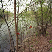
At the museum of Contemporary Photography, Paula McCartney’s newest work Bird Watching is currently being displayed. McCartney’s idea for this project was sparked from the long walks she would take in the woods. She would always see birds in these landscapes that she would like to photograph, but she decided that they were too far away or the birds were not in the exact location for these compositions to be esthetically pleasing. So, McCartney decided that she would buy her own fabricated birds to place in nature to photograph. It is interesting that she decided to combine nature that is alive and growing and man made materials that were created to resemble nature. She makes you question what is real in her scenes and whether or not this is an important detail. Personally after reading her artist statement and then looking at the photographs, I could instantly tell that there was an artificial look to these songbirds she has so carefully positioned in the trees of her landscape photographs. Without her statement I would have questioned if they were real or not, which makes her photos successful. She gets the viewer to engage in the photographs and ask the questions that she had presented for them. I think it is important that these birds are fabricated. When looking at these photographs I feel like these are illusions that are meant to trick you. If you do not observe these scenes carefully, it’s easy to overlook the fact that the main subject is fake. It makes me realize that we are so easy deceived. I also look at these photographs and think that we make our own happiness, and that’s exactly what McCartney has done. She wanted to photograph songbirds in certain landscapes, and she made this happen.

Bianca submits Tillman Crane


Tillman Crane is an alternative processes photographer. He prints in platinum and paladium to achieve his painterly images. When looking through the website I most appreciated his "artist statement" because it was something that I could relate to-- which made his work intriguing to me. I do not photograph structures or architecture very often, however the stories behind his subject matter was interesting. I do know that there are a few of you guys in our class that enjoy this type of imagery so I figured he would be a nice addition to our blog. :) Enjoy.
www.tillmancrane.com